To create an effective pricing page, prioritize clarity and simplicity in your design. Organize your pricing options with a navigation sidebar and use a feature comparison matrix to help users quickly find the information they need. Highlight key features and differences between plans, and consider alternative display options like tabs or drop-down menus. Make sure your pricing table is optimized for mobile devices and includes a clear call-to-action to drive conversions. By following these best practices, you'll be well on your way to creating a pricing page that effectively communicates your product's value and drives sales - and there's even more to discover to take your pricing page to the next level.
When crafting pricing plans, imagine you're traversing a dense forest - you need a clear path to follow.
A well-designed pricing page can increase sales by 10% or more.
To create an effective pricing page, focus on user experience. Organize your pricing options using a navigation sidebar, like HubSpot's, to help users quickly find the information they need.
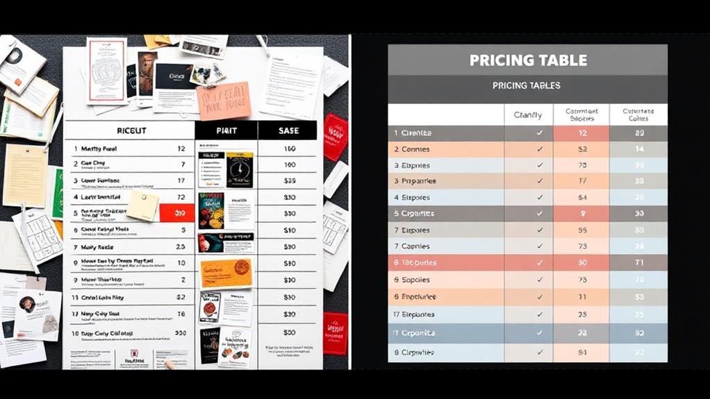
Use an exhaustive feature comparison matrix with headings repeating for each new section, and consider using separate columns with checkmarks to simplify the design and make it more scannable.
Present your plans in a simple pricing layout, highlighting key features initially and displaying all other features only if requested.
Consider using a toggle between monthly and annual pricing, in addition to a currency selector, like Notion's pricing page.
A clear and concise overview of pricing plans, like HelloFresh's, can improve user experience and increase conversions.
Don't forget to include a prominent call to action to encourage users to make a purchase.
As you plunge into feature comparison tables, imagine yourself charting a dense forest of options, where clarity is key to finding the perfect path.
You want to make it easy for users to scan and compare your plans, so they can make an informed decision on your pricing page.
To simplify your feature comparison table, break down complex features into simple, bullet-point lists. This makes it easier for users to compare and contrast different options.
Use a clear and concise format with clear headers and minimal clutter to increase comprehension by up to 50%. You can also show attributes separately in one column with checkmarks in each column to simplify the design and make it scannable.
When creating your feature comparison table, strike a balance between too much detail and too little detail to make complex pricing plans scannable.
Highlight key differences between plans, such as "unlimited" or "priority support", to draw attention to the unique value proposition of each option.
Ultimately, consider including a "recommended" or "most popular" option in the table to guide users towards the most suitable choice and increase conversions.

Now that you've simplified your feature comparison table, it's time to focus on the general design of your pricing table.
The layout of your pricing page can substantially impact conversion rates, so it's vital to get it right. A well-designed pricing table should prioritize clarity over creativity, with clear and concise labels, minimal clutter, and a clear call-to-action (CTA) to drive conversions.
Consider using a navigation sidebar, like HubSpot's, to help users quickly find the pricing information they need and reduce bounce rates. Your pricing table should also be optimized for mobile devices, with a responsive design that adapts to smaller screens and guarantees a seamless user experience.
Effective pricing table design should make it easy for users to compare plans and prices, like HelloFresh's pricing page. By using a clear and concise design, you can reduce friction and increase conversions.
Furthermore, consider using a customizable pricing table, like Second Nature's, to help users feel more in control and invested in their purchase decision, leading to higher conversion rates.
Your pricing table should prioritize clarity over creativity, and highlighting key features and differences is crucial to achieve this goal.
By doing so, you'll make it easy for customers to compare your plans and make informed decisions. Start by showcasing the most significant features that set your plans apart, and only display supplementary details if users request them.
This approach, seen on Contentful's pricing page, guarantees that users quickly understand the value proposition. To further simplify the comparison process, consider using design elements like color-coding, as seen on Airtable's pricing page, or hiding unavailable features to make it clear what's included in each plan.
By highlighting key features and differences, you'll increase conversions and reduce customer confusion. Remember to prioritize the most significant details and avoid overwhelming users with too much information.

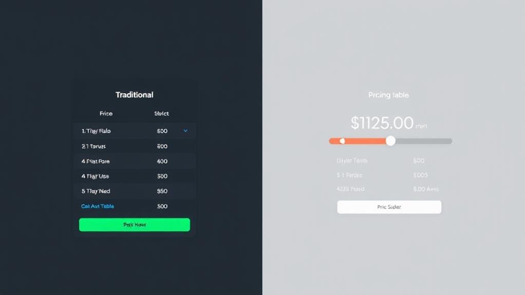
When you're creating a pricing page, a traditional grid or table layout may not be the most effective way to display your options.
You can consider alternative ways to display pricing that cater to your users' needs. For instance, you can group plans into tabs like Zendesk, allowing users to compare all plans at once. Alternatively, you can provide a drop-down menu like N26, letting users choose which plans to study side-by-side.
On Rows, pricing plans are presented within a spreadsheet, making it interactive and easy to examine. You can also wrap multiple plans onto separate rows like Dropbox, making it easy to scan and compare prices and features.
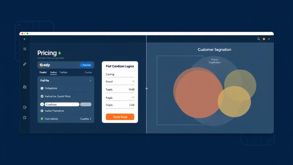
Another approach is to let users customize their pricing experience by choosing which plans appear most relevant to them. HubSpot's pricing page features a navigation sidebar that allows users to choose which tools they want to see price options for, making it easy to customize their plan.
A well-crafted pricing page requires careful consideration of several vital elements to effectively communicate your product or service's value proposition and drive conversions.
You need to make it easy for people to quickly understand the pricing options, so a simple layout with clear and concise writing is vital.
A visible call-to-action (CTA) button, like "Buy Now" or "Get Started," should be prominently displayed to encourage visitors to take action.
You also need to provide a clear List of Features for each plan, so users can choose the right one for their needs.
A navigation sidebar can help users easily choose which tools they want to see price options for, making it a vital element for effective pricing pages.
Furthermore, consider providing a special welcome offer for new subscribers or a clear and concise overview of meal plans and pricing to incentivize users to make a purchase.

Beyond the essential elements, the most effective pricing pages incorporate advanced strategies for customization, allowing users to tailor their experience and increasing the likelihood of conversion. By providing customization options, you enable users to choose the features and services that best fit their requirements, leading to a more personalized and satisfying experience. This can be achieved through different plans, credibility indicators, and free trials that reverse the risk from the user to the company.
| Pricing Page | Customization Strategy | Effect on Conversion |
|---|---|---|
| Autopilot | Slider and selector for complex pricing | Easy for visitors to understand plans |
| Second Nature | Customizable plan with preview | Users feel in control of their purchase |
| HubSpot | Navigation sidebar for tool selection | Easy to compare and select the right plan
By incorporating a sense of urgency on your pricing page, you can motivate visitors to take action sooner rather than later, increasing conversions by as much as 14%.
This can be achieved by using limited-time offers, countdown timers, or scarcity messaging to encourage immediate action.

Your pricing page's success hinges on establishing trust with potential customers, and social proof is a powerful way to do so.
To build trust, you can utilize customer testimonials, trust badges, and security certificates. These elements increase conversions by 10-15% and establish credibility, as 85% of consumers trust online reviews as much as personal recommendations.
Trust badges, such as SSL certificates or security seals, can increase conversions by 7-10% by alleviating security concerns.
Strategically placing social proof elements, like customer testimonials, near the call-to-action (CTA) button can increase the likelihood of conversion. You can also display ratings and reviews from reputable third-party sources, like G2 Crowd or TrustRadius, to provide social proof and increase trust in the brand.
Furthermore, consider incorporating a trust indicator, such as a "risk-free trial" or "money-back guarantee", to reduce anxiety and increase conversions by 20-30%. By incorporating these social proof elements, you can build trust with potential customers and increase the chances of conversion.
In respect of pricing pages, every detail counts, and optimization is key to driving conversions.
You want to make it easy for users to choose the best plan for their needs and take action.
To optimize your pricing page for conversions, consider the following strategies:
You create an effective pricing strategy by understanding your target audience's needs, setting clear goals, researching competitors, and testing different pricing models to find the sweet spot that resonates with your customers and drives revenue growth.
You're probably wondering what a pricing plan page is - it's a webpage that clearly displays a company's different pricing options and tiers, allowing you to compare and choose the best fit for your needs.
You're designing a pricing plan, so prioritize clarity and simplicity. Start by highlighting key features, then allow users to customize or compare plans. Use sticky headers, tooltips, and clear overviews to make informed decisions easy.
You're creating pricing packages, so keep it simple with 3-5 options, each with a clear, concise name that communicates its benefits. Make sure they're organized logically, with clear distinctions between features and benefits, and consider using anchor pricing to make lower-priced options more attractive.
You've crafted a well-designed pricing page that effectively communicates your product's value. By simplifying feature comparison tables, highlighting key differences, and creating a sense of urgency, you've set yourself up for conversion success. Remember to optimize for mobile, build trust with social proof, and consider alternative display methods. With these strategies in place, you'll be well on your way to maximizing revenue and driving business growth.