To create an effective site footer, you'll want to prioritize simplicity, clarity, and organization. Aim for a reasonable size, typically between 200-400 pixels in height, and use a clear font to make your content easy to scan. Organize your footer into sections using headings and bullet points, and consider adding a newsletter signup to keep users engaged. Vital links and information, such as contact details, social media links, and a copyright notice, should also be included. By incorporating these elements, you'll be well on your way to creating a footer that enriches user experience - and there's more to investigate to take your footer to the next level.
Designing a Simple Footer
Five essential elements make up a simple yet effective site footer: a copyright notice, contact information, social media links, a sitemap or navigation, and a brief disclaimer or terms of use statement.
When designing your website footer, you want to guarantee it's easy to navigate and understand. A simple footer is key to providing a good user experience. You'll want to prioritize the content you include in this area, making sure it's concise and relevant.
In terms of layout, keep your footer size reasonable, usually between 200-400 pixels in height.
This will guarantee it doesn't overwhelm your website's main content. Use a clear font and organize your footer content into sections using headings and bullet points.
Consider adding a newsletter signup to keep users engaged. Remember to keep your copyright text up to date and include social media links to encourage users to follow your brand.
Your website's footer is an ideal place to provide users with crucial links and information that supplement the main menu navigation.
This is where you can include necessary links and information that establish credibility and trust with users.
Some necessary links and information you should consider including in your footer:

When building a site footer, don't overlook the opportunity to collect valuable user data and establish transparency by incorporating a newsletter signup and essential legal information.
| Footer Element | Description |
|---|---|
| Newsletter Signup | Collects and verifies email addresses, increasing conversions when limited to 5 or fewer form fields |
| Legal Information | Includes critical details like privacy policy, cookie policy, and terms and conditions |
| Copyright Notice | Establishes ownership and usage rights, including business licenses, accessibility, and security information
By incorporating a newsletter signup and legal information, you've taken the initial steps in creating a thorough site footer.
Now, it's time to add some supporting content and logos to augment the user experience and provide value to visitors.
To get started, consider adding the following elements to your footer:
* Logos: Showcase your brand identity and utilize social proof by featuring partner or media logos where your business has been featured.
Verify they're easily readable and recognizable, and consider using a slider or grid layout to display multiple logos in a small space.
Remember to balance the amount of content to avoid overwhelming the user, and verify the size and color of logos are consistent with your design theme.

Most websites feature a footer, but few truly maximize this valuable real estate. A well-designed footer can improve user experience, increase conversions, and bolster a website's credibility by providing vital information and easy navigation. Effective footers should prioritize simplicity, consistency, and clarity, avoiding clutter and guaranteeing that key links and information are easily accessible.
| Best Practice | Importance |
|---|---|
| Include contact information (email address, phone number) | Easy access to get in touch with the website owner |
| Add social media links | Increase engagement and following |
| Display a copyright notice | Establish ownership and protect intellectual property |
| Incorporate a call to action | Encourage users to take a specific action |
| Optimize for mobile devices | Guarantee a seamless user experience across devices
Examples of effective footers can provide valuable inspiration for your own website's design.
Take a look at these examples to spark your creativity:
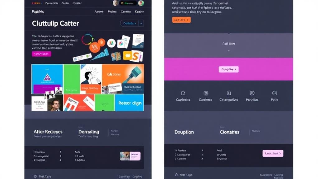
These examples showcase how to effectively use design elements like CTAs, social media links, newsletters, and copyright notices to create a functional and visually appealing footer.
You can also take note of how they balance whitespace and visual interest to make their footers easy to navigate.

Now that you've gathered inspiration from effective footer examples, it's time to focus on creating a visually appealing and consistent footer design for your website.
A well-designed footer should blend in with the rest of your website, using graphic elements to make it visually appealing and adhering to your site's writing style and design theme to maintain consistency.
When choosing a color scheme, consider your website's theme and guarantee sufficient contrast and readability in the footer. If your website has a light background, use dark text, and vice versa.
Incorporating graphic elements, like logos or icons, can add visual interest to the footer, but be cautious not to overload the space.
Consistency is key, so use a consistent design theme in the footer, including colors, styles, and graphic elements. This will help to maintain a cohesive look and feel throughout your website.
You're wondering how to make a good footer for a website, right? Start by prioritizing fundamentals like main pages, contact info, and social media links, while keeping it organized and visually appealing with clear labels and contrasting colors.
You optimize a footer by ensuring it's responsive, consistent, and loads quickly, then add a clear CTA, effective whitespace, and accessibility features, making it easy for visitors to find what they need and take action.
You're wondering what size your website's footer should be. Generally, it should take up 10-20% of the screen's vertical space, but the ideal height varies depending on the device and website design, ranging from 100-300 pixels.
When choosing a font for your website's footer, you'll want to select one that's easy to read in small sizes, like serif fonts Merriweather or Georgia, or sans-serif fonts like Open Sans or Lato, which provide a clean and simple look.
You've now got a solid foundation for creating an effective site footer. Remember to keep it simple, prioritize vital links and information, and don't forget to include supporting content and logos. By following best practices and staying inspired, you'll craft a footer that strengthens user experience and supports your brand. With a well-designed footer, you'll be well on your way to converting visitors into loyal customers.