When designing an effective contact form, prioritize a seamless user experience that drives lead generation and conversion rates. Cater to diverse user needs, including general inquiries, support requests, and sales or business opportunities. Use a clear call-to-action, guiding users to submit their questions or requests and facilitating a prompt response. Limit form fields to only the essential information needed, and consider a single-column layout with easy-to-read and fill-out fields. By optimizing your contact form's placement, management, and design, you'll be well on your way to building a robust email list and providing a user-friendly experience that encourages engagement - and there's more to investigate on this topic.
When designing a contact form, it's pivotal to comprehend its purpose.
It's not just about creating a way for users to get in touch with your business; it's about creating a seamless user experience that drives lead generation and conversion rates.
As a business owner, you want your contact form to cater to diverse user needs, including general inquiries, support requests, and sales or business opportunities.
A well-designed contact form should have a clear call-to-action, guiding users to submit their questions or requests and facilitating a prompt response from your website or business.
Furthermore, it should collect key contact information, helping you build an email list and provide targeted marketing opportunities.
By understanding the contact form's purpose, you can design a user-friendly and efficient interface that meets user needs and achieves your business objectives.
Crafting an effective contact form is a delicate balance of aesthetics, usability, and functionality.
When designing contact forms, you should prioritize a clear and concise layout with easy-to-read and fill-out form fields. Limit the number of fields to only the vital information needed, as too many fields can lead to form abandonment and negatively impact conversion rates.
Use a single-column layout and place the label above each field to improve the user experience and reduce errors. Adding a clear and prominent call-to-action (CTA) button, such as "Submit" or "Send Message", can encourage users to complete the form and increase conversions.
Guarantee your form is responsive and mobile-friendly, making it easily accessible and usable on different devices.
On your contact page, consider adding a FAQs section to answer users' questions directly and provide helpful resources. By following these best practices, you can create a contact form that increases conversions and reduces bounce rates.

As you plunge into the world of contact forms, you'll unearth that there's no one-size-fits-all solution.
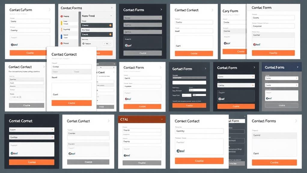
Different types of contact forms cater to varying business needs and goals. For instance, vertical contact forms are a standard format with fields laid out vertically, making it easy for users to fill out and submit the form.
Multi-step forms, on the other hand, take customers through a series of questions to filter leads, allowing businesses to qualify potential customers and prioritize follow-ups.
Linear contact forms are single-column forms where users fill out one field at a time, making it easy to complete but potentially lengthy.
Nonlinear contact forms are multi-column forms where users can fill out multiple fields simultaneously, making it faster but potentially overwhelming.
Conditional contact forms are dynamic forms that change based on user input, allowing for more targeted and relevant questions.
Conversational contact forms mimic a conversation, using natural language and a back-and-forth dialogue to gather information.
By strategically placing your contact form, you can substantially influence the user experience and conversion rates.
When creating a contact form, one must ponder its placement to make it easily accessible and visible to users. Placing a contact form at the bottom of all web pages can improve UX by making it more convenient to submit the form.
Furthermore, incorporating a contact form in the footer or sidebar can make it easily accessible from any page on the website. Optimizing contact form placement involves strategically placing the form above the fold, making it easily accessible and visible to users, and reducing the likelihood of users missing it.
Using a floating contact form that follows the user as they scroll down the page can also increase visibility and encourage users to fill it out. What's more, placing a call-to-action (CTA) above the contact form, such as "Get in Touch" or "Contact Us", can draw users' attention to the form and encourage them to take action.

Once you've optimized your contact form's placement, it's crucial to manage form submissions effectively to guarantee a seamless user experience.
This involves setting clear expectations for response times and follow-up actions, establishing a process to address customer questions and concerns, and ensuring timely resolution of user queries.
To achieve this, consider the following strategies:
About 20% of website visitors are willing to share their contact information in exchange for valuable content or support.
By incorporating a contact form on your website, you can tap into this pool of potential subscribers and build a robust email list.
One effective way to do this is by adding a checkbox or opt-in field to your contact form, giving users the option to subscribe to your email list.
This not only confirms compliance with anti-spam laws but also allows you to filter and sort leads based on the information they provide.
You can then use this information to target specific segments of your email list with relevant content and promotions, increasing the chances of converting them into paying customers.
By integrating your contact form with email marketing software, you can automatically add new contacts to your email list and trigger targeted email campaigns to nurture them through the sales funnel.
This is a powerful way to capitalize on your contact form and build a loyal following of subscribers who are enthusiastic to hear from you.

When designing a contact form, you're not just creating a way for users to get in touch - you're crafting an experience that can make or break their willingness to engage with your brand.
To guarantee a seamless user experience, it's vital to follow best practices for contact form design.
By incorporating thoughtful design elements, you can transform your contact form into an intuitive and seamless experience that delights users and encourages them to engage with your brand. A well-designed contact form should have a clear and concise layout, with input fields that are the right size to match the expected length of answers. This guarantees a seamless user experience.
| Design Element | Benefit | Impact on User Experience |
|---|---|---|
| Logical flow | Keeps forms organized and easy to fill out | Reduces user frustration and increases form completion |
| Concise layout | Minimizes friction and improves conversion rates | Encourages users to complete the form quickly |
| Responsive design | Certifies forms are accessible on different devices | Provides an ideal experience regardless of device
You're wondering how to create a good contact form. Start by keeping it simple, with only vital fields like name, email, and phone number. This will reduce friction and improve completion rates, making it easy for users to get in touch with you.
You optimize your contact form by limiting fields to necessities, using a logical flow, and clear labeling, then test and adjust based on user feedback, making it responsive and mobile-friendly to improve user experience and conversion rates.
You make a good form design by prioritizing simplicity, clarity, and concision, ensuring a clear flow and minimal fields, and using clear labels, whitespace, and a clean design to reduce friction and enhance conversion.
You create an effective form by prioritizing crucial info, ordering fields from easy to hard, and using clear labels. Then, add a prominent CTA, optional fields, and consider a FAQs section and optimized confirmation page to guide users smoothly through the process.
You've made it to the end of this guide on designing effective contact forms! By now, you should have a solid understanding of how to create forms that convert, manage submissions efficiently, and even build your email list. Remember to keep your forms simple, optimize their placement, and make them user-friendly. With these best practices in mind, you'll be well on your way to turning visitors into valuable leads.