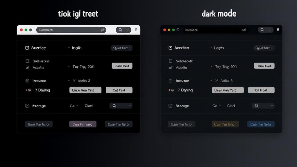
When designing for dark mode, you'll want to prioritize contrast, avoiding pure black backgrounds and opting for a moderate level of contrast instead. Choose background colors that complement your text, and select fonts that are clear and legible, with sufficient contrast to certify readability. Icons should be simple, recognizable, and distinguishable from the background. By striking a balance between aesthetics and readability, you can create an immersive dark experience that amplifies user engagement. Now, examine these vital guidelines further to create a dark mode design that truly stands out.
Designing for Dark Mode Fundamentals
When designing a dark mode UI, you'll want to focus on the necessities.
A well-designed dark theme should have sufficient contrast to guarantee readability. This means avoiding pure black as a background color, as it can be overwhelming.
Instead, opt for a dark background with a moderate level of contrast. High distinction between background and text is vital, so choose background colors that complement your text.
To get started, consider the following key elements:
When crafting a dark mode UI, you'll need to go beyond the basics and plunge deeper into the principles that govern exceptional design. It's not just about inverting colors; you need to ponder the intricacies of color, typography, and layout to create a seamless user experience.
| Design Element | Dark Mode Considerations | Best Practices |
|---|---|---|
| Color | Avoid pure black, use dark grays and blues | Guarantee sufficient contrast with background |
| Typography | Clear, legible fonts with sufficient font size | Font colors should provide sufficient contrast |
| Icon Design | Simple, recognizable, and distinguishable from background | Use single-color or limited-color palettes |
In dark mode UI design, contrast is key. You should prioritize sufficient contrast between UI elements and the background to guarantee an accessible design. Typography plays a vital role, with clear and legible fonts, sufficient font size, and font colors that provide sufficient contrast with the background being vital considerations. By mastering these principles, you can create a dark mode UI that's not only visually appealing but also provides a smooth user experience.

Five key considerations can make or break your dark mode design.
Initially, ditch pure colors and opt for varying levels of dark gray to reduce eye strain and improve user experience. This subtle approach will create a more comfortable UI for users.
Next, utilize empty space to create a minimalist and scannable interface that allows users to absorb information better.
Be mindful of contrast when choosing colors - high-contrast colors can make text hard to read, so select a palette that guarantees text visibility and icon accessibility.
Preserving brand identity in dark mode is vital; desaturate UX elements while maintaining the logo and finding a balance between transmitting brand emotions with new colors.
Ultimately, use shadows subtly and with caution, as they can create a confusing interface that distracts from the core message. Elevations can be achieved through other design elements instead.
To craft an immersive dark experience, you'll want to prioritize user comfort above all else.
This means avoiding pure colors, pure white text, and high-contrast colors that can cause eye strain. Instead, opt for a background that provides enough contrast for users to easily scan and absorb information.
Utilize negative space to create a minimalist design that makes the page scannable and helps avoid overwhelming users in dark mode.
When it comes to brand identity, adapt it for dark mode by desaturating colors, using darker shades of the brand color, and finding a balance between transmitting brand emotions with new colors.
Be cautious when using shadows, as they can create a confusing interface that distracts from the core message. Elevations can be achieved through other design elements instead.
At last, adjust images to blend in with the dark mode by using a general filter to adjust contrast and brightness, and optimize them for dark mode.

Dark Mode Design Considerations
Your design's dark mode needs careful consideration of diverse components to certify a seamless user experience.
When designing for dark mode, this is vital to think about the color palette you're using. Avoid Pure blacks, as they can cause eye strain, especially when paired with bright whites.
Instead, opt for a desaturated dark surface color that provides a subtle contrast. A black background can be overwhelming, so balance it with lighter elements to create visual harmony.
When choosing your color palette, consider the legibility of your text. Light text on a dark background can be challenging to read, so verify there's sufficient contrast.
You can use online tools to check the accessibility of your color scheme. Furthermore, think about the icons, buttons, and other UI elements that will be used in your design.
Make sure they're easily distinguishable from the background and each other. By carefully considering these design elements, you can create a dark mode that's both visually appealing and user-friendly.
When creating visually appealing designs, you emphasize contrast. This principle helps you create clear hierarchies, making content accessible and engaging. In dark mode, contrast is vital to guarantee your design doesn't get lost in the darkness, making it easier for users to navigate and consume information.
You're looking for the perfect dark mode color palette! Aim for a dark background with a value of #121212 or darker, and consider desaturated palettes with splashes of brand color for a functional and visually appealing design.
You're wondering how to create colors for dark mode. To start, you'll want to desaturate your brand colors and mix them with dark grays to create a cohesive palette that's easy on the eyes.
You can make your logo compatible with dark mode by desaturating original colors, adjusting brightness and contrast, and ensuring legibility; consider creating a separate variant with a darker palette, and prioritize simplicity and recognizability.
By now, you've learned the fundamental principles and best practices for designing an effective dark mode experience. Remember, it's all about creating a harmonious balance between aesthetics and usability. By mastering dark UI design principles, considering user preferences, and following design best practices, you'll be well on your way to crafting an immersive dark mode that delights your users.