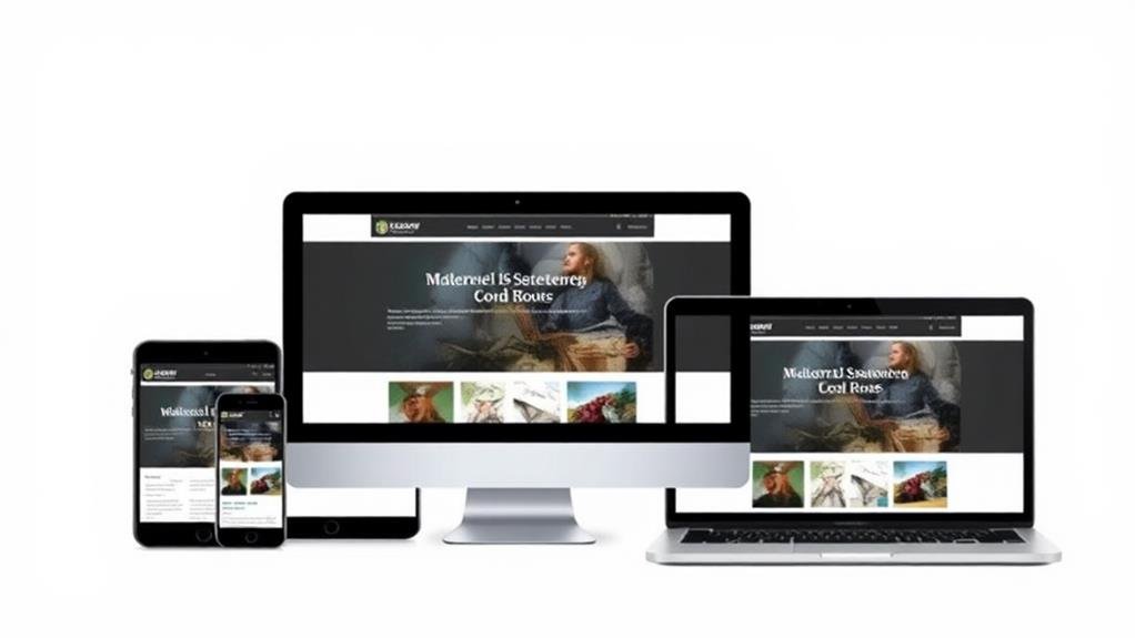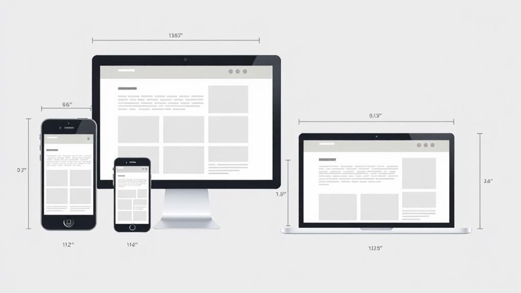
When designing for different screen sizes and resolutions, you'll want to adopt a responsive design approach that adapts to diverse screen sizes, considering a mobile-first strategy to certify a seamless user experience. Identify device groups based on user tasks and scenarios, understanding interactions, limitations, and context-dependent behavior. Design for a range of screen sizes and orientations, using media queries, flexible images, and relative units to guarantee flexibility. Test and iterate on multiple devices, prioritizing content accessibility and readability. By doing so, you'll be well on your way to crafting a consistent and immersive experience across devices - and there's more to investigate on this path.
Understanding Core User Experience
Your goal as a designer is to create a seamless user experience regardless of the device or screen size.
You want users to navigate your website or app effortlessly, whether they're on their mobile devices, tablets, or desktops.
To achieve this, you need to adopt a responsive design approach that adapts to different screen sizes.
This means designing for a consistent user experience across multiple devices, guaranteeing that your content, layout, and visual elements adjust smoothly to fit each screen.
When designing, consider a mobile-first approach, focusing on the smallest screen size first.
This will help you prioritize content and simplify your layout, making it easier to scale up to larger screens.
Remember, users expect a consistent experience across devices, so it's crucial to test your design on multiple screens to facilitate a smooth shift.
To effectively design for different screen sizes, you need to group devices by the tasks users are likely to focus on, and then identify the scenarios in which your product will be used across these device groups.
This involves understanding how users interact with different device types, such as mobile phones, tablets, and desktops, and considering the limitations of each device.
When identifying device groups, keep in mind the following:

As you set out on designing for multiple screens and devices, keep in mind that it's not just about adapting your design to fit different screen sizes, but about creating a cohesive experience that bridges the gaps between devices.
You're designing for a range of screen sizes and orientations, considering the limitations of each device and the user's needs and goals. This means identifying different scenarios in which the product will be used across device groups, such as mobile phones, tablets, desktops, smart TVs, and smartwatches.
When designing for multiple screens, you'll need to employ responsive design techniques, using media queries and flexible images to guarantee your design adapts to varying screen sizes.
You'll also need to define device groups based on the tasks the user is likely to focus on, and design an experience suitable for each scenario. By treating devices as facets of the same experience, you can provide a consistent user experience across different device groups, using CSS styles to fine-tune your design for each screen size.
With careful planning and testing on multiple devices, you can create a seamless experience across multiple screens.
You've carefully planned and designed your product to adapt to multiple screen sizes and devices, considering the unique characteristics of each.
Now, it's vital to guarantee a consistent and seamless experience across all devices. This is where responsive design comes into play.
By using media queries, you can create a design that adapts to different screen widths and heights, providing a peak experience for users regardless of the device they're using.
To achieve a cohesive user experience, keep the following in mind:

Considering Device-Specific Features and Limitations
Your product's design should harness the unique strengths of each device, incorporating features that cater to their distinct capabilities and limitations.
This means designing for touch, voice, and gesture interactions to augment the user experience. You can utilize device-specific features, such as GPS, camera, and accelerometer, to provide a more immersive and engaging experience.
Guarantee that these features are accessible on all devices, including those with smaller screens, limited processing power, or varying input methods.
When designing for different screens, consider the limitations of each device, such as screen size, resolution, and processing power.
This will help you optimize the design and performance of your application. With responsive design, you can create an immersive experience that adapts to different screen resolutions and sizes.
One crucial aspect of designing for different screen sizes is testing your product on real devices with real users to identify and resolve UX issues before release.
This certifies that your responsive design is functional and user-friendly across multiple devices and screen sizes.
When testing, consider the following key areas:

As you plunge into designing for multiple screens and devices, it's vital to concentrate on the core user experience that solves a problem and provides value.
Identify the most common and vital tasks that customers need to complete to design a seamless experience across devices.
When designing for multiple screens, consider the limitations of each device, and design for a range of screen sizes and orientations. A consistent experience means the app and its experience are similar across all screen sizes, treating devices as facets of the same experience.
To provide a smooth experience, consider device-specific features and limitations, utilize device-specific features to augment the UX, and verify features are accessible on all devices.
Adopt a responsive design approach to accommodate different screen sizes and resolutions.
Conduct usability tests on multiple devices, including mobile screens, to identify issues with responsiveness, usability, and performance.
You'll need to create flexible designs that adapt to different screens by using responsive principles, prioritizing vital content, and testing on real devices to guarantee a seamless experience across multiple screen sizes.
You'll need to adapt your design to accommodate varying screen sizes and orientations by using flexible grids, scalable images, and media queries that adjust layouts and styles based on different screen dimensions and orientations.
You'll need to adapt your design to fit diverse screens, so start by prioritizing mobile-first, using responsive principles and flexible units like vw and vh to guarantee a seamless experience across different screen sizes.
You'll use CSS media queries to target specific screen sizes, writing different styles within each query to adapt your design; for example, '@media (max-width: 768px) { /* styles for small screens */ }' and '@media (min-width: 1024px) { /* styles for large screens */ }'.
You've made it! By now, you should have a solid understanding of how to design for different screen sizes and resolutions. Remember to prioritize your users' needs, consider device-specific features, and test your designs thoroughly. With these strategies in place, you'll be well on your way to creating a seamless and consistent user experience across multiple devices.