You're considering using a hamburger menu on your desktop website, but you're not sure if it's the right choice. While the hamburger icon has become ubiquitous on mobile devices, its effectiveness on desktop is a different story. Studies have shown that users prefer navigation options that are visible and easily accessible, rather than hidden behind a small icon. But what are the specific drawbacks of using a hamburger menu on desktop, and how can you create a more intuitive navigation experience for your users? The answer lies in understanding the nuances of desktop navigation.
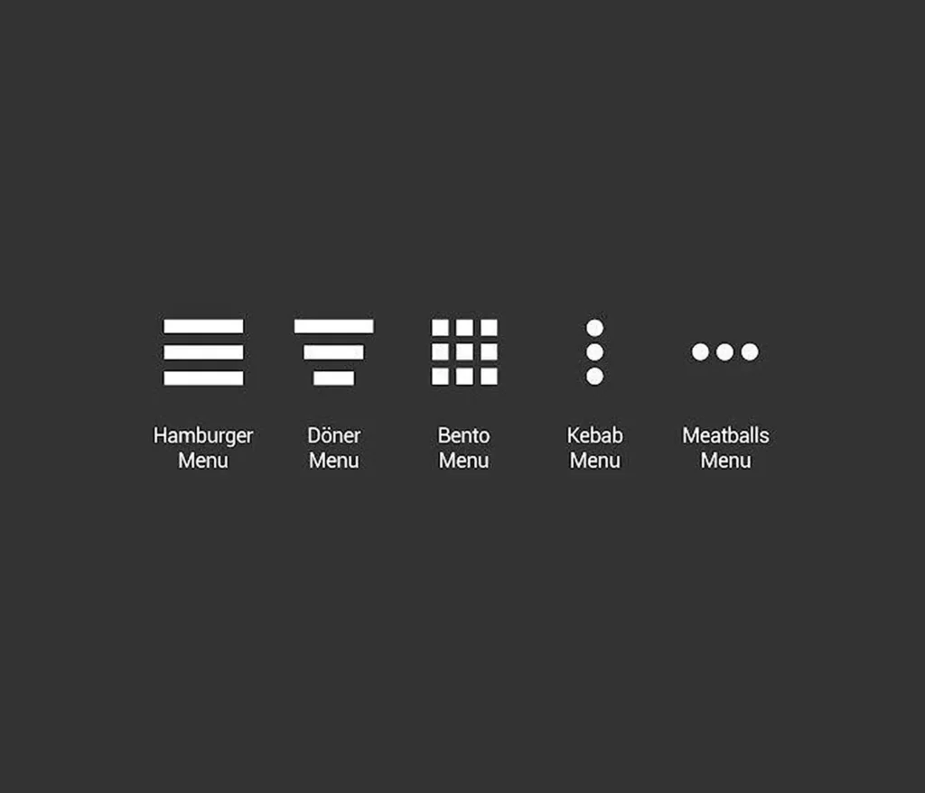
When you think of a hamburger menu, you probably picture an icon of three stacked horizontal lines - the now-ubiquitous symbol of a hidden navigation menu. This design originated from early digital trends and is associated with minimalist design approaches. The hamburger menu is primarily designed to save space by concealing navigation options until clicked.
While effective for mobile interfaces, its usability on desktops remains a topic of debate. For a desktop website, a hamburger menu can hinder visibility and engagement due to its hidden nature. Studies indicate that users interact more with visible navigation menus than with hidden ones, making traditional horizontal navigation more effective for desktop environments.
A well-designed hamburger menu on desktop requires clear labeling, visual cues for interaction, and consideration of user demographics to improve navigation experience. To make the most of this design, consider the following key elements: visible navigation links, clear menu design, and intuitive navigation options.
Considering the potential benefits of a hamburger menu on desktop, it's likewise significant to acknowledge the drawbacks that can impact user experience.
Hamburger menus can be detrimental to navigation on desktop, as they conceal crucial information and reduce discoverability. By hiding vital links, you risk decreasing engagement and increasing user frustration.
Hamburger menus can complicate user pathways, forcing users to navigate through multiple clicks rather than accessing content directly. This may lead to increased abandonment rates. Furthermore, users may find the hamburger icon confusing, with 52% of individuals over 45 not recognizing it, potentially hindering usability for that demographic.
Additionally, hamburger menus on desktop can negatively impact SEO effectiveness. Key links are concealed until the menu is clicked, reducing visibility to both search engines and users. This can ultimately affect your website's search engine rankings.
On desktop, it's crucial to prioritize visibility and accessibility. You must weigh the benefits of a hamburger menu against the potential drawbacks to guarantee that your navigation doesn't compromise user experience.

A well-designed desktop navigation system is the backbone of a user-friendly website, allowing visitors to effortlessly find what they're looking for. When deciding on a desktop navigation system, it's crucial to take into account a few best practices to guarantee a seamless user experience.
| Best Practice | Description |
|---|---|
| Use a horizontal menu | Take advantage of ample screen space to display all navigation items at a glance. |
| Limit navigation options | Restrict menu options to 5-7 to prevent overwhelming users and improve decision-making efficiency. |
| Prioritize key pages | Position critical pages prominently in the navigation structure to facilitate forward movement and enhance user flow. |
| Visually distinct CTAs | Confirm calls to action are clear and distinct to guide users toward desired actions. |
| Monitor analytics | Evaluate user engagement with navigation to refine and optimize the menu structure for better user experience. |
By implementing a well-designed desktop navigation system, you can create a seamless user experience. However, using a hamburger menu on your desktop site may not be the best approach. A hamburger menu's hidden navigation can decrease visibility, leading to lower engagement rates and negatively impacting your website's comprehensive user experience.
Studies show that users interact more frequently with visible menus, which can result in higher click-through rates for significant links.
When it comes to UI design, it's crucial to prioritize users' interests. However, hamburger menus can hinder usability, especially for older users, as approximately 52% of users over 45 don't recognize the hamburger icon.
Moreover, the complexity of tiered navigation within a hamburger menu can create barriers for users, making it challenging to navigate effectively. These issues can lead to increased user frustration and negatively impact general satisfaction and retention.
As you consider your website's navigation, keep these factors in mind to guarantee you're creating a user-friendly experience that meets your users' needs.

Limitations of hamburger menus on desktop become apparent when we examine their impact on navigation and user behavior. As you consider implementing a hamburger menu on your desktop version, it's crucial to weigh the potential drawbacks.
One significant limitation is decreased visibility of significant navigation links. When menu items are hidden behind a hamburger icon, users may overlook them, leading to lower engagement rates.
Research indicates that users interact more frequently with visible menus on desktops, suggesting that hamburger menus can negatively impact click-through rates on critical links.
In addition, a significant 52% of users over the hill of 45 don't recognize the hamburger icon, which can hinder usability for a portion of your audience. Hidden navigation requires extra clicks to access, which can frustrate users and result in decreased site engagement and increased abandonment rates.
Traditional visible menus, on the other hand, provide a clearer user experience by presenting all categories upfront, meeting desktop users' preference for immediate access to navigation options.
Now that we've examined the limitations of hamburger menus on desktops, you may be wondering what alternatives can better meet your users' navigation needs.
Consider switching to a horizontal navigation bar, which optimizes screen space and lets users see all available options at a glance without extra clicks. Dropdown menus are another option, providing a way to offer supplementary links without cluttering the main navigation area.
For content-rich websites, mega menus display multiple levels of navigation in a single, expandable dropdown, improving visibility and findability of key links.
If you have extensive navigation needs, a vertical sidebar can house multiple links and categories while maintaining easy access. In-page links can also facilitate quick navigation within longer content, enhancing user experience by reducing time spent searching for information.
Unlike hamburger navigation, these alternatives allow users to access critical sections of your web page without an extra click. By exploring these alternatives, you can create a more user-friendly website menu that meets your users' needs and provides a better navigation experience.

When designing an effective navigation strategy for your website, you'll want to contemplate the user's experience and how you can streamline their path to find vital content. Research indicates that desktop screens offer ample space for traditional horizontal navigation, which provides immediate visibility of links and facilitates quicker access to content without extra clicks. In contrast, hamburger menus can decrease visibility on desktop sites, leading to lower engagement rates.
Consider the following navigation strategies for your website:
| Navigation Type | Pros | Cons |
|---|---|---|
| Hamburger Menu | Streamlined design, space-saving | Decreased visibility, lower engagement rates |
| Visible Menus | Immediate visibility, better accessibility | Space-consuming, cluttered design |
| Combination Navigation | Improved usability, clean design | Requires balance between visible and hidden navigation |
Best practices recommend using a combination of visible and hidden navigation to improve usability, ensuring that key links are readily accessible while still maintaining a clean design. This approach can enhance the user experience, increase engagement rates, and provide a more intuitive navigation system for your website.
You're considering adding a hamburger menu to your desktop site, but think twice. It can hide navigation, decrease engagement, and frustrate users. Instead, use the screen space for a traditional, visible navigation menu.
When designing for desktop, you shouldn't use a hamburger menu on complex sites, or for older audiences, as it reduces visibility and increases navigation complexity, ultimately frustrating users and hindering their experience.
You'll use a hamburger menu to save screen space, improve aesthetic appeal, simplify navigation, and minimize decision fatigue. It also accommodates different screen sizes and aligns with modern web design trends for a cleaner interface.
On your computer, you'll find the hamburger menu as a three-lined icon, often used to hide navigation options, saving screen space and creating a cleaner interface, commonly seen on websites and web applications you use.
You've weighed the pros and cons of using a hamburger menu on desktop, and it's clear that traditional navigation methods are often a better choice. By ditching the hamburger icon, you can create a more intuitive and satisfying browsing experience for your users. Instead, opt for horizontal navigation or dropdown menus that provide immediate access to links. This approach will improve findability, reduce frustration, and ultimately lead to a more user-friendly website.