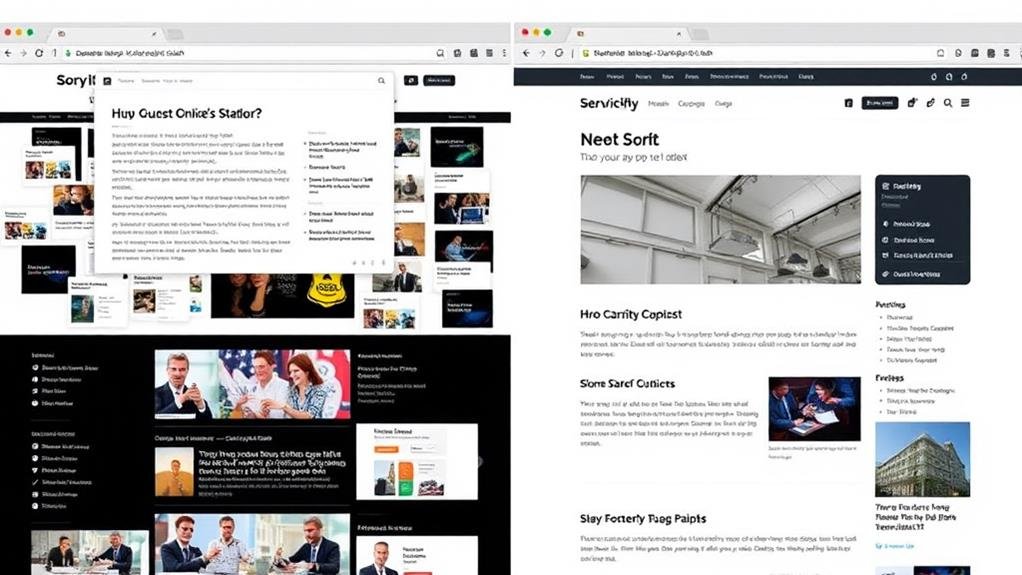
When considering whether to use a sticky header in your website design, weigh the benefits: it can augment user experience, simplify navigation, and reinforce your brand's identity. Ideal for content-heavy or long-scrolling websites, sticky headers keep critical elements in view, reducing scrolling time and encouraging users to complete their purchases. By prioritizing essential navigation elements and streamlining the design, you can create a seamless experience that keeps visitors engaged. To get the most out of this design element, examine the mechanics, best practices, and potential pitfalls – and uncover how to strike the perfect balance between functionality and aesthetics in your website design.
Weighing the utility of sticky headers means considering their impact on your website's general user experience.
As you design your site, you want to guarantee that users can easily navigate through your content without getting lost or frustrated. Sticky headers serve as an anchor for users, granting them constant access to navigation, thereby enhancing the total user experience.
They can reduce scrolling time and simplify the process of moving between website sections, particularly useful for content-heavy or long-scrolling websites. By keeping your navigation bar fixed at the top of the page, you're providing a consistent theme across different pages and reinforcing brand recognition.
Furthermore, many popular ecommerce sites use sticky headers to keep the shopping cart in view, encouraging users to complete their purchases. By incorporating a sticky header into your website design, you can create a seamless user experience that keeps your visitors engaged and coming back for more.
Understanding Sticky Header Mechanics
As you plunge into incorporating a sticky header into your website design, pin down the underlying mechanics to guarantee a seamless execution.
A sticky header, also known as a fixed header, remains at the top of the screen as the user scrolls down. This allows for easy navigation, as the header remains visible and accessible at all times.
To achieve this effect, you'll need to use CSS to set the header's position to "fixed," which removes it from the normal document flow. This means the header will overlap other content, so you'll need to adjust the padding or margin of the page's main content to accommodate it.
When implemented correctly, a sticky header can greatly augment the user experience, providing quick access to navigation and other vital elements. By grasping the mechanics behind sticky headers, you'll be well-equipped to create a website that's both functional and visually appealing.

When designing a website, it's vital to determine the ideal scenarios for incorporating a sticky header, as it can significantly improve the user experience.
Sticky headers are particularly beneficial when a site requires frequent navigation, such as informational sites where users might need to reference different sections regularly. They're also useful on single-page applications where vital tools need to be kept in constant view, improving user experience and engagement.
Additionally, sticky headers can boost conversion rates by keeping key calls-to-action visible, making them suitable for online stores and blogs.
They're ideal for websites with lengthy content pages or multiple levels of navigation, allowing users to quickly access the content they seek. Moreover, websites that need to keep prominent content or features visible, such as search functions and notification alerts, can also benefit from using sticky headers.
With a clear understanding of the ideal use cases for sticky headers, it's time to plunge into the best practices for implementing them effectively. When designing a sticky header, you should prioritize vital navigation elements to avoid overwhelming the user. Remember, the goal is to aid the user's actions, not dominate their screen real estate.
To guarantee a seamless user experience, keep the following best practices in mind:
| Best Practice | Why It Matters |
|---|---|
| Limit sticky headers to 20-30% of the screen on mobile devices | Prevents overwhelming the user and maintains a clean design |
| Streamline critical actions and prioritize crucial elements | Aids user navigation and reduces clutter |
| Verify responsiveness across different screen sizes and orientations | Provides a superior user experience regardless of device or orientation |
| Make sticky headers navigable via keyboard and screen readers | Guarantees accessibility for all users |

As you implement sticky headers, you'll need to strike a balance between functionality and aesthetics.
This balance is vital in web design, as it directly impacts user experience. A sticky header that's too prominent can dominate the screen real estate, leading to a dip in user satisfaction. Research suggests that occupying more than 20-30% of the screen with a sticky header on mobile devices can have negative effects.
To achieve balance, limit your sticky header to vital elements, guaranteeing it's noticeable but not intrusive.
Streamline the elements to aid core actions, avoiding clutter and overwhelming the user. Remember, the sticky header should serve a purpose for users, not hinder their experience.
By doing so, you'll create a positive augmentation to your site. Regular user testing can guide your design decisions, helping you find a balance that works for your target audience.
Furthermore, guarantee your sticky header is navigable via keyboard and screen readers to maintain accessibility.
Considering the visual hierarchy of your website, you'll need to thoughtfully integrate your sticky header into the general design.
This means certifying it doesn't overwhelm the rest of the content, and instead, complements it. Think about the navigation and how it will interact with the sticky header. You want to create a seamless user experience, where visitors can easily find what they're looking for without feeling cluttered or distracted.
When designing your sticky header, consider the screen space and how you can optimize it.
A well-designed sticky header should take up minimal space, allowing the main content to shine. You can achieve this by using a simple design, minimal text, and a clean layout. Furthermore, think about how your sticky header will adapt to different screen sizes and devices. A responsive design is vital to guarantee a consistent user experience across all platforms.
Ultimately, your sticky header should augment your website's design, not hinder it. By carefully considering these design implications, you can create a sticky header that not only looks great but also improves navigation and total user experience.

Now that you've carefully considered the design implications of your sticky header, it's time to navigate the potential pitfalls that can hinder its effectiveness.
A poorly designed sticky header can be detrimental to your user experience, distracting users and taking up valuable screen real estate.
To avoid this, it's vital to keep your sticky header concise and limited to vital elements, as overloading it with links or information can lead to clutter and decision paralysis.
Furthermore, verify your sticky header is responsive, adapting to different screen sizes and orientations to prevent a poor user experience.
Failing to test your sticky header with real users can result in unintended consequences, such as obstructing content or causing usability issues.
Consequently, user testing is vital to verify your sticky header is effective and functional.
When designing a website, you're not limited to a traditional sticky header.
There are alternative design options that can provide a better user experience, especially on mobile devices.
Some alternatives you can consider include:
These alternatives can provide better access to navigation and menu options, improving the total user experience and enhancing the accessibility of your website.

You've evaluated alternative design options and considered the pros and cons of sticky headers. Now, it's time to make an informed design decision.
To do so, consider the specific nature of your website and your design preferences. If your website has a lot of content, a sticky header can boost user experience by providing constant access to navigation, reducing scrolling time, and simplifying the process of moving between sections.
On mobile devices, sticky headers can be particularly beneficial, keeping key features or areas in view as users navigate through longer, narrower pages. However, it's vital to verify your sticky header is well-designed, proportional to the screen size, and doesn't distract users from the content.
Conduct a cost-benefit analysis of the elements your sticky header contains and their necessity to determine whether they'll truly improve user experience. By weighing these factors, you'll make a well-informed decision about whether a sticky header is right for your website design.
You're wondering if a sticky header is good for a website. Well, it can be beneficial for navigation and branding, but it can also be distracting and take up valuable screen space, so it really depends on your website's specific needs and design.
You're deciding whether to fix or stick your header, considering navigation frequency and content length. If users need it often, fix it; if not, streamline on scroll, and don't forget to weigh a fixed sidebar as an alternative.
You're wondering if you should use a sticky navigation bar; consider your website's content and audience - if it's info-heavy, a sticky nav can save users time, but if it's simple, it might be distracting, so weigh the pros and cons before deciding.
You're looking for alternatives to sticky headers, and you've got options! Consider a partial sticky header, scroll-to-top button, hidden navigation menu, fixed sidebar or footer, or a dynamic header that adapts to scrolling behavior.
So, should you use a sticky header in your website design? It ultimately depends on your specific needs and goals. If you've got a lot of content, a sticky header can be super helpful. But if your site is simple and sweet, it might be overkill. Take the time to weigh the pros and cons, consider your users' needs, and test it out before making a final decision. By doing so, you'll create a website that's both functional and visually appealing.