You're about to design a search functionality that will make or break your website's user experience, so it's vital to get it right. Initially, verify you really need a search function, as it's not necessary for all websites. Then, design a search box that's easy to find, has a clear input field, and an iconic magnifying glass. Optimize your search results with filtering options, query reformulation, and clear displays. Implement an effective auto-suggestion mechanism, and design results pages that are clean, concise, and logical. Avoid common search UX mistakes, and follow best practices for search results. Now that you're off to a great start, you'll want to investigate more ways to refine your search functionality.
When deciding whether to implement search functionality on your website, consider the size and complexity of your site.
If your website has fewer than 100-200 pages, you mightn't need search functionality, as users can easily navigate through the site without it. However, if you're building an e-commerce site, news portal, or a site offering bookings for flights, vacations, and deals, search functionality is a must-have.
This is because users typically have specific needs and requirements that they need to find quickly.
As your website grows in size and complexity, search becomes more pivotal to the user experience.
It's vital for users to find specific content quickly and efficiently. Good search functionality can lead to increased user satisfaction and loyalty, as it helps users quickly find what they're looking for.
Additionally, search is critical in building trust with users, as it demonstrates your website's ability to provide relevant and accurate results.
Now that you've determined your website needs search functionality, it's time to focus on designing an effective search box.
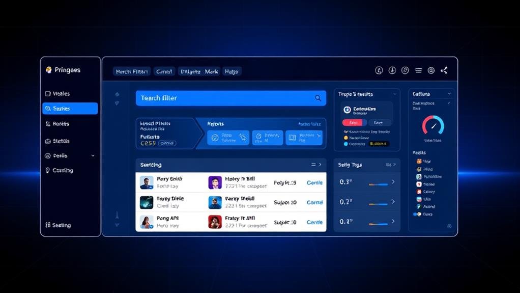
A well-designed search box is vital to providing a seamless search experience for your users. To get it right, you should make your search box prominent and easily accessible on every page, with a clear and consistent design language throughout your website or application.
When it comes to the search box design, a magnifying-glass icon should accompany the search input, as it has universal recognition and helps users quickly identify the search feature.
The search box should retain an open text-entry field for users to quickly type in their search query, and avoid hiding search behind an icon, which makes the feature less noticeable and increases interaction cost. Place the search box in the top center or top right of the page, where users expect to find it, and guarantee it's large enough to accommodate long queries, with a minimum of 27 characters.

Beyond making your search box easily accessible and visible, optimizing search functionality is crucial to delivering a seamless search experience.
When a user submits a search query, you want to guarantee they get relevant search results that meet their expectations. To achieve this, provide filtering options on the results page to help users refine their search.
This could include a sort feature to arrange results by relevance, date, or rating. Furthermore, consider implementing query reformulation to suggest alternative search queries based on the user's input. This can be especially helpful when the initial search results are limited or irrelevant.
When displaying search results, use a clear and concise format that makes it easy for users to scan and find what they're looking for. By optimizing your search functionality, you can substantially improve the search user experience and increase the chances of users finding what they need.
As you refine your search functionality, incorporating an effective auto-suggestion mechanism can substantially improve the search experience.
This mechanism helps users construct their search query by providing search query suggestions that reduce data input and guide them towards accurate and speedy results.
To make the auto-suggestion mechanism effective, follow these best practices:

Your search functionality's success hinges on the quality of your results pages, which must strike a delicate balance between presenting accurate information and facilitating intuitive user navigation.
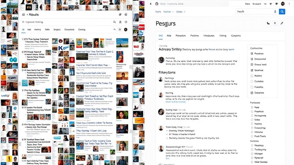
When designing results pages, consider the layout and presentation of product information. You can choose between list view and grid view, depending on the type of products and the amount of information required.
For instance, list view is ideal for products that require detailed information, such as model numbers and ratings, while grid view is better suited for products that require less information, such as apparel. Allow users to switch between list view and grid view, and provide a product summary to aid decision-making.
It's also vital to display the number of matching results to help users make informed query reformulations. If the search takes more than 10 seconds, consider adding a progress indicator to keep users informed.
Ultimately, on the No Results page, clearly explain that there are no matching results and offer alternative products or categories to guide users towards relevant information.
The spotlight shifts to the search query and results display, the linchpin of your search functionality.
This is where users see the fruits of their labor, and you want to make sure it's a satisfying experience.
When it comes to displaying search results, you've got options.
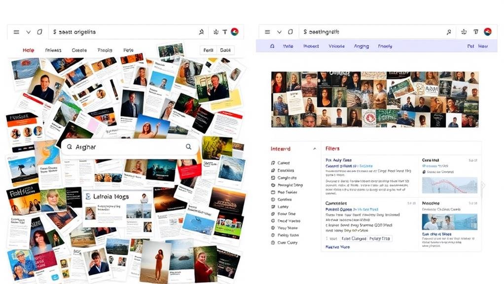
You can choose between a list view, grid view, or even a combination of both.
The key is to guarantee that the results are easy to scan and understand.

Deadly search UX mistakes lurk around every corner, waiting to sabotage your users' experience.
One common mistake isn't providing a clear results page that helps users find what they need. When users can't find what they're looking for, they'll search again, and again, until they give up.
To avoid this, make sure your results page is organized, using a list view or contextual category or search filters to help users narrow down their options.
Another mistake is neglecting to include a sort feature. This is especially vital when users need to sift through a large number of results.
Without a sort feature, users are forced to scroll through pages of results, leading to frustration and abandonment. By incorporating Best Practices, such as a clear search query and relevant filters, you can guarantee that users find what they're looking for quickly and easily.
Crafting effective search results pages requires attention to detail and a deep understanding of user behavior.
As you design your search results page, bear in mind that users judge your site's conversion rates based on the initial page of results. To keep users engaged, prioritize the most crucial results on the initial page and display the total number of search results to help them decide how long to spend looking through the list.
When it comes to content presentation, consider the following best practices:
When designing search functionality, you'll want to prominently display the search field, guarantee accessibility, provide a clear search button, and use a recognizable icon.
When designing a search result page, you're prioritizing user experience. You display the number of results, choose a suitable layout, and offer view options, ensuring users quickly find what they need and can easily scan and understand the results.
You'll want to design a search interface that's intuitive and accessible, placing the search field prominently with a recognizable icon, and ensuring it's easily accessible on every page, including dead-end pages like 404.
When designing a search page in UX, you'll want to prominently display a large search bar with a placeholder text and button, making it easily accessible on every page, even dead-end ones like 404.
You've made it to the end! By now, you've learned the importance of search functionality and how to design it effectively. Remember, a well-designed search function can make or break the user experience. Keep in mind the fundamentals, optimize for functionality, and avoid common mistakes. By following these best practices, you'll be well on your way to creating a search function that users will love.