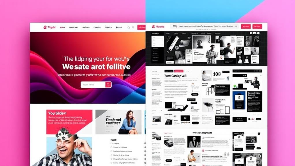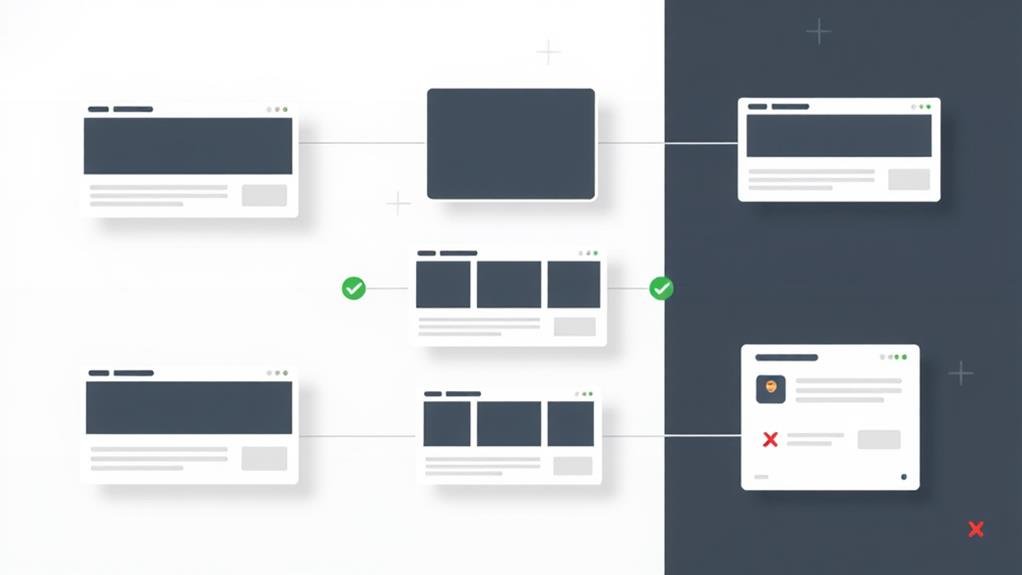
When designing your website's homepage, you'll likely consider using sliders to showcase content, but it's vital to weigh the pros and cons. On the plus side, sliders can create a visually appealing experience, enhance user engagement, and tell a story. However, they can also hinder page load times, negatively impact search engine optimization, and overwhelm users. To use sliders effectively, identify situations where they genuinely augment the user experience, and follow best practices like responsive design and image layering. By understanding the benefits and drawbacks, you can make an informed decision that balances your design goals with user needs, and uncover how to optimize their potential.
Delve into the world of sliders, and you'll quickly realize that they're a versatile tool for web designers, suitable for multiple contexts.
A slider, fundamentally a slideshow on a website, can be used to display images or items, and its purpose is best served when companies utilize it to showcase relevant material or professional portfolios.
This enables designers to offer multiple options and allows users to browse through them swiftly. You'll find diverse types of sliders, including showcase sliders, vertical accordion sliders, and full-width sliders, each with its unique features and uses.
When implemented correctly, sliders can augment user experience by providing an interactive album of photographs or illustrating a series of related features.
However, it's vital to examine design elements, such as image layering, load times, and responsive design, to guarantee a seamless user interaction on the Web.
Many websites have successfully harnessed the power of sliders to augment their visual appeal, and it's easy to see why.
Sliders in web design offer a multitude of benefits, making them a popular choice for many websites.
By employing sliders, you can create a visually appealing experience for your visitors.
Within sliders, you can tell a story, highlight key products, or showcase a breadth of services.
This interactive element can transform passive spectators into active participants, granting a sense of autonomy to the user and boosting their total site engagement.
Some of the key benefits of using sliders include:

While sliders can clearly add visual appeal to your website, their drawbacks can't be ignored.
One major con is their impact on page load times, which can lead to a higher bounce rate and reduced conversions. A 1-second delay can result in a 7% reduction in conversions, making sliders a potential obstacle to achieving your website's goals.
Moreover, sliders can hinder search engine optimization (SEO) efforts, as search engines struggle to index and crawl the content within them, leading to reduced visibility in search results and poor SEO performance.
In a similar vein, sliders can be distracting and overwhelming for users, particularly on mobile devices, where the small screen size and touch-based interface can make traversing through slides difficult.
Most slider plugins also fail to follow responsive design best practices, leading to a poor user experience on mobile devices, where most web traffic comes from.
With these drawbacks in mind, a crucial consideration is to balance the benefits of sliders against their potential negative impact on your website's performance and user experience.
One key consideration when deciding to use sliders is to identify situations where they can genuinely augment the user experience and reinforce your brand.
You want to use sliders when they can help users quickly find what they're looking for, such as when showcasing products or services.
This is especially crucial for e-commerce sites, where highlighting popular products, new arrivals, or certain categories can draw attention to specific items or promotions.

What makes a slider truly effective: is it the type you choose or how you use it?
As a website designer, you have multiple slider types to select from, each with its unique characteristics. Showcase sliders offer a clean design, while vertical accordion sliders are ideal for compact spaces. Full-width sliders provide an immersive experience, and horizontal accordion sliders make navigation easy. Standard sliders offer flexibility and control.
When choosing a slider, consider responsive design to guarantee it adapts to different screen sizes.
Few slider plugins follow responsive design best practices, so select one that does. Image layering can augment the user interface, but prioritize textual content to avoid overwhelming users.
A well-designed carousel can effectively display a collection of photographs or tell a story. However, consider the page's aim and use data to back up your decision to use a carousel.
Remember, only 1% of viewers engage with homepage carousels, and 84-89% of those who click only interact with the primary slide.
You'll find that using sliders can compromise your website's speed, distract users from main content, and lead to poor user experiences, especially on mobile devices, resulting in low click-through rates and negatively impacting SEO performance.
You're wondering if sliders slow down your website? Yes, they do! Sliders can increase page load times by 2-3 seconds, negatively impacting user experience and SEO, making visitors leave and affecting your business goals.
You're wondering if sliders are outdated, and honestly, they're not entirely, but they're certainly not as trendy as they were a few years ago, and you might want to ponder more modern design elements to make your site stand out, and think about incorporating alternative visual features.
You should avoid carousels and sliders on your website because they're ineffective, with only 1% of users interacting with them, and they can harm your site's loading times, SEO, and accessibility, ultimately distracting from your actual content and decreasing engagement.
You've weighed the pros and cons of using sliders on your homepage, and now it's time to decide. Remember, sliders can be an effective way to showcase multiple messages, but they can also slow down your page load time and confuse visitors. Use them sparingly, make sure they're mobile-friendly, and test their performance. With careful planning and execution, sliders can improve your website's user experience – but don't overdo it!