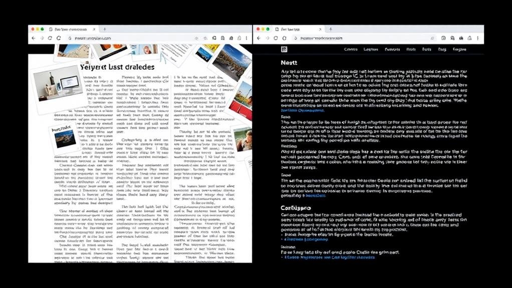
When it pertains to designing a visually appealing and readable layout, you're likely wondering what the ideal content-to-white space ratio is. The answer is that you should allocate 30%-50% of your total design space to white space, striking a balance between content and empty space. This ratio creates a clear visual hierarchy, improving readability and preventing overwhelm. By maintaining consistency across pages or sections, you'll preserve visual coherence and guide your viewer's attention. Now, dive deeper into the world of white space to uncover how to measure, adjust, and optimize it for maximum engagement.
When you step into a well-designed museum, you're often struck by the deliberate use of empty space around exhibits.
This thoughtful use of white space is a key design principle that guides the viewer's attention, creating a clear visual hierarchy and improving user experience.
In web design and graphic design, white space is vital for readability, as it helps to separate layout elements and prevent overwhelming the viewer.
Aim to allocate 30%-50% of the total design space to white space, striking a balance between content and empty space.
Consistency is key, so maintain consistent white space ratios across pages or sections to preserve visual coherence.
The squint test can help you check the balance and contrast of a layout, identifying areas that are too crowded, empty, or similar.
Measure the Success of Your Design with Precision
When it comes to measuring and adjusting white space, you'll want to get precise.
A white space ratio calculator can help you determine the exact amount of empty space in your layout, ensuring you strike the ideal balance between content and visual breathing room.
Aim for a ratio of 30%-50% white space to create a clear visual hierarchy and improve readability.
Consistency is key, so maintain a consistent white space ratio across pages or sections to preserve visual coherence.
To fine-tune your design, try the squint test.
Step back, squint at your layout, and identify areas that are too crowded, empty, or similar.
This technique helps you assess the balance and contrast of your design.
Experiment with different layout variations and seek feedback from others to refine your use of white space.
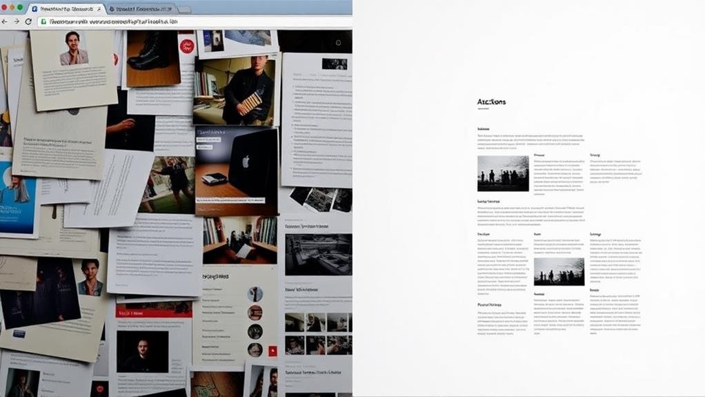
You'll find that incorporating grids and guides into your design process is crucial for maintaining the balance and harmony you've worked hard to achieve with your content-to-white space ratio.
By using grids, you can create a consistent design layout that guarantees your web page looks great on multiple devices, making it necessary for responsive design.
Guides, on the other hand, help you align elements and maintain ideal text readability.
The Importance of Visual Hierarchy
A well-balanced content-to-white space ratio is only half the battle; a clear visual hierarchy is pivotal to guide visitors through your web page.
When you create a visual hierarchy, you're organizing elements on your page to direct the user's attention. This hierarchy helps you prioritize content, making it easier for visitors to focus on what's vital.
By using size, color, and placement, you can create a clear order of significance, ensuring your message gets across.
To create an effective visual hierarchy, consider the design elements you're working with.
Use headings, subheadings, and bullet points to break up content and create a clear structure.
This will improve readability and help users quickly scan your page.
Don't forget to balance your visual hierarchy with white space, allowing your design to breathe and giving visitors' eyes a break.
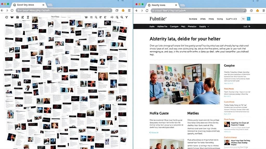
As you endeavor to create a visually appealing design, one essential aspect to ponder is balancing content and white space.
This delicate balance is pivotal in achieving your design goals, as it directly impacts user engagement and readability.
The ideal content-to-white space ratio is subjective, but a general guideline is to aim for 30%-50% white space.
While aiming for the ideal content-to-white space ratio is vital, it's just as necessary to steer clear of common mistakes that can sabotage your design.
One of the most significant errors isn't understanding the importance of white space. You might think that using too much white space is a waste, but it's actually pivotal for readability.
When you don't leave enough space between design elements, your text becomes cluttered and overwhelming. This makes it difficult for viewers to focus on the vital information.
To avoid this, make sure you're using an adequate amount of white space to guide the viewers' attention. Don't be afraid to leave some breathing room between paragraphs, images, and other design elements.
This will make the text more digestible and improve the total user experience. Remember, white space isn't just empty space – it's a pivotal component of your design that can make or break your message.

To elevate your design game, master the art of balancing content and white space by incorporating advanced techniques into your workflow.
One way to do this is by using white space to create a sense of hierarchy and guide the reader's attention.
By strategically placing white space around major layout elements, you can create focal points that draw the reader's eye and control reading speed.
You'll often find that mastering the delicate balance of content and white space is key to creating a harmonious and visually appealing design.
By striking the right content-to-white space ratio, you can achieve a balanced design that's easy on the eyes and engaging to the user. Aim for a ratio of 30-50% white space to create a sense of harmony, but don't be afraid to experiment with higher or lower ratios depending on your content's complexity.
Effective use of white space can improve readability, increase user engagement, and guide the viewer's attention through your design.
Consistency in white space usage is key to creating a cohesive and visually appealing design that exudes luxury and sophistication.
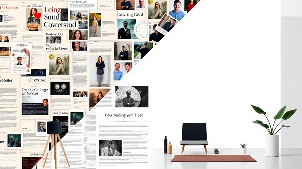
As you endeavor to create a harmonious balance between content and white space, it's vital to understand the pivotal role white space plays in design.
Effective use of white space requires practice and refinement of skills, as it helps create balance, contrast, hierarchy, and clarity in design.
When used correctly, white space can markedly improve readability by guiding the reader's eye through the layout.
When designing for engagement, you're likely to find that streamlining white space is crucial to holding your audience's attention. Aim for a content-to-white space ratio of 30%-50% to create a perfect balance between information density and visual comfort. This ratio allows for better readability, reducing eye strain and increasing reading speed.
| Effect of White Space | Result |
|---|---|
| 10% increase in white space | 20% surge in reading speed, 15% reduction in eye strain |
| Consistent white space ratio | Sense of harmony, improved user engagement |
| Experimenting with ratios | Refined approach to perfect engagement
You're wondering what the white space rule is. It's a design principle that recommends using enough blank spaces in your layout to maintain clarity and balance. You should leave space between lines of text, paragraphs, and design elements to guide the viewer's attention.
You're wondering what constitutes too much white space? Well, when you overdo it, your design feels empty, lacks visual interest, and becomes difficult to navigate, disjointed, and slow-paced, ultimately negatively impacting user experience and engagement.
You're wondering what's the appropriate use of white space? Well, you're on the right track! You effectively use white space when you guide the viewer's attention through content, creating a clear visual hierarchy and improving readability and comprehension.
You'll find that whitespace substantially enhances readability by augmenting reading speed and comprehension; in fact, it can increase reading speed by up to 20% and comprehension by up to 30%, making it crucial for a comfortable reading experience.
You've now mastered the art of balancing content and white space! By understanding white space principles, measuring and adjusting it, using grids and guides effectively, and creating harmony with white space, you're well on your way to crafting engaging designs that communicate your message with clarity and precision. Remember, optimizing white space is key to capturing your audience's attention and guiding them through your content.