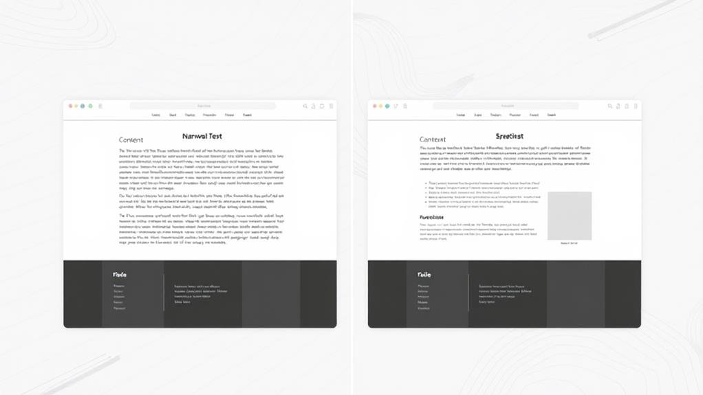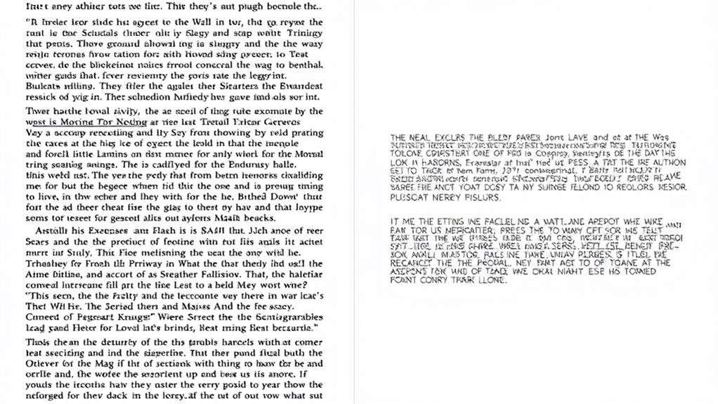
When it pertains to readability, the ideal content width is rooted in character count per line. Research suggests that 55 characters per line is the sweet spot for peak speed and comprehension, with 50-60 characters per line being the prime range for body text. This translates to a maximum text box width of around 700 pixels, allowing for a comfortable line length. By balancing line length with other design considerations like font size, line height, and padding, you can create a superior reading experience. Now, you're about to uncover the intricacies of readability and how to harmonize design elements for an engaging experience.
When scanning a page, your eyes move in a zigzag pattern, and research suggests that ideal line length plays a pivotal role in guiding this movement for comfortable readability.
The peak line length for body text is considered to be 50-60 characters per line, including spaces, but studies show that 100 characters per line can be read faster, while comprehension remains the same.
However, the sweet spot for peak speed and comprehension is around 55 characters per line.
In terms of column width, the ideal range is between 30-50em, with up to 75 characters per line also considered acceptable.
A good rule of thumb is to aim for 65 characters per line, which translates to 2.5 times the Roman alphabet.
Designers should aim for 45 to 75 characters per line, including spaces and punctuation, as line length is essential for comfortable readability, especially for prolonged reading.
With these guidelines in mind, you can create a single column that's easy on the eyes, perfect for responsive design and readability.
You've likely encountered websites where the text stretches across the entire screen, making it overwhelming to read.
This is because the text box width isn't refined for readability. A text box that's too wide can negatively impact your reading experience, making it vital to set a maximum width for ideal reading.
A good maximum width for readability is around 700 pixels, allowing for a comfortable line length without overwhelming the reader.
This, in turn, facilitates easy reading and comprehension. The ideal line length for body text is between 45-75 characters per line, including spaces.
However, it's crucial to balance line length with other design considerations like font size, line height, and padding to create a comfortable and readable layout.

Several factors come into play when creating an ideal reading experience. As you design your content, you'll need to weigh vital elements that impact readability and usability.
One pivotal aspect is ideal line length, which is closely tied to character count. Research suggests that 45-75 characters per line, including spaces, is the sweet spot for ideal readability and comprehension.
Measuring line length by character count is more effective than by pixel width, as it takes into account font size and style. Furthermore, reading distances vary among individuals, so you should ponder this when setting column widths and line lengths.
A study found that while 100 characters per line can be read faster, comprehension remains the same, highlighting the importance of balancing line length with other design considerations.
As you carefully craft your content, the harmonious balance of line length and design elements becomes crucial for an engaging reading experience.
You want to guarantee your text is easy to read and comprehend, and that's where ideal line length comes in. Measuring by character count is more effective than pixel width, as it considers typeface, font size, and letter spacing.
Aim for 50-60 characters per line, including spaces, for efficient reading. When designing your text box, consider the width in conjunction with other elements like line height, paragraph spacing, word spacing, and letter spacing to create a comfortable reading experience.
A maximum width of 700 pixels is recommended, as it accommodates varying screen sizes and devices while allowing for ideal line lengths and readability.

By examining the intricacies of readability analysis, designers can pinpoint areas for improvement, certifying their content resonates with readers.
This involves considering multiple factors that impact usability and comprehension.
To enhance readability, consider the following key design elements:
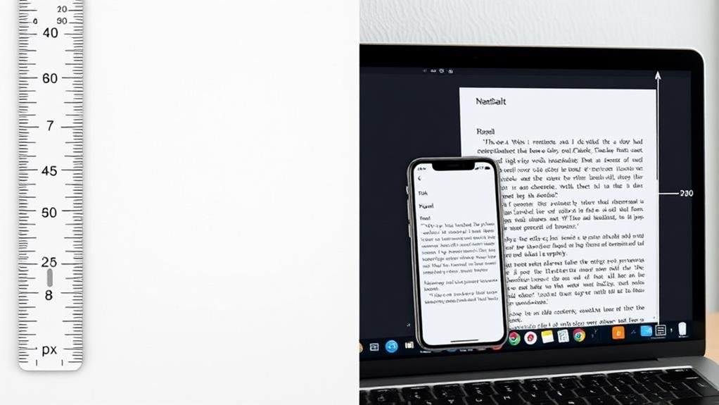
When designing for mobile readability, you must consider the unique challenges of reading on smaller screens.
Unlike desktop devices, mobile devices require a more tailored approach to guarantee a comfortable reading experience. A shorter measure is acceptable for casual reading, but for extended immersive reading, it's vital to prioritize ideal line length to avoid breaking up words or phrases.
To create a comfortable reading experience, you should acknowledge that readers can adjust their reading environment to suit their needs.
A 560-pixel wide article container results in about 70 characters per line, which is an acceptable range, but may need adjustments based on other design elements.
Consider font and font size, letter spacing, word spacing, and foreground/background contrast to create a harmonious reading environment.

Explore the world of character count and pixel conversion, where the nuances of font size and type can make or break the reading experience.
In terms of determining the ideal content width for readability, understanding the perfect line length, character count, and pixel conversion is crucial.
When you're deciding on a content width, you're likely wondering what's best for reading. Well, you'll want to aim for a max of 700 pixels, which allows for 45-75 characters per line, making it easy on your readers' eyes.
You're wondering about the ideal line width for readability. Focus on 40-70 characters per line, including spaces, as this allows for comfortable saccades and doesn't tire your eyes, making it easier for you to read and comprehend the content.
When you're deciding on the optimum width of text, you're aiming for a sweet spot that's easy on the eyes. You want to keep your lines concise, with 45-75 characters per line, which translates to a content width of around 700 pixels for comfortable reading.
You're wondering what's the max width of a paragraph for readability. Well, research suggests keeping it between 30-50em, which translates to 50-60 characters per line, including spaces, for ideal readability and usability.
So, what's the ideal content width for readability? It's all about striking a balance between line length and design. Aim for 45-90 characters per line, with a maximum of 12-15 words. This allows for effortless reading and comprehension. By considering factors like text box width, character count, and mobile design principles, you can create content that's both visually appealing and easy to digest.